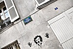
 Hands
Up Hands
UpThe overall
lightness of this shot has a tendency to make the camera shut
down and not let enough light in, so the whites turn out muddy
grey - one to watch out for. I had to bump up the white point
after on the computer and my later treatment darkened things
down again, but it's ok.
What I really like about this shot is the corners jutting into
the shot all around the funny guy on the wall. Lovely sharp
lines with really the only thing which isn't linear being the
guy. Quite striking really. |


