|
FREE On-Line Digital Photography Course "Doggy Doos" Animals add a touch of magic to any photo, and Paris isn't short of 'em. Although pooch poop is almost a thing of the past thanks to a massive clamp down on careless canine crapping, the number of dogs hasn't diminished in the slightest as far as I can see. This was a lovable if rather lornsome chap we came across on a Saturday morning tour which had wandered into the Marais. I thought we could stick our noses into the wonderful Marais dance centre where you find the famous Café de la Gare, which is, or course, a... theatre, and where you are surrounded by dance studios radiating energies of every wavelength, and there he was...
Key points
Today I offer you five
pictures, taken within three minutes of each other. If you
had to choose ONLY ONE of them as a legacy of that sweet
meeting, which would it be? Decide now, before reading
further.
Capturing a Feeling
Obviously the most
important thing in these shots is the dog. You got that,
didn't you?! But that's not quite enough. To capture a
moment which can claim to have something to say, you need
more.
Let's look at this in
more detail.
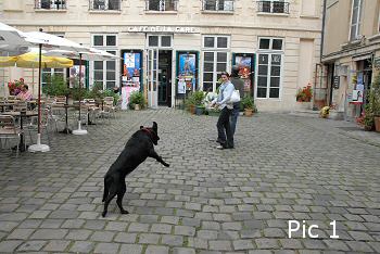
In Pic 1 the dog's in
full flight, jumping at a tossed tennis ball, but
unfortunately you can see neither his face or the ball. Two
important aspects missing: his face to 'humanise'
(animalise...?) the shot, and the ball to understand why
he's in that weird position.
A unique feature of Pic
1 is that there is a human, well, sorry, Maureen, one of my
clients on the tour, to be more precise. And she's
interacting with the dog by looking at him and smiling,
giving us a reflected sence of pleasure and fun.
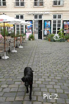
In Pic 2 we have a
different story. Here pooch has successfully retried
aforementioned ball and is mooching up for another go.
Direct contact with the viewer, full face-on with a purpose,
but unfortunately again you can't really see the ball.
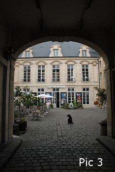
Pic 3's Unique Selling
Point is the archway of course, but we'll talk about that
later. In this section we're talking about what the subject
is doing, or isn't doing, or what he may be feeling etc. if
we allow ourselves to anthropomorphosise slightly. Here he's
showing us a nice profile silhouette, which does have a
certain charm, although from a distance his head does look
rather like that of a snub-nosed duck.
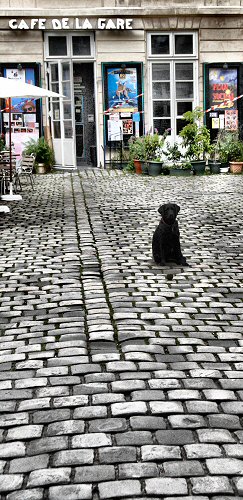
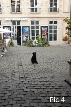
Pic 4 is marvellous
precisely because of it's lack of activity. Why? Because we
just know he wants someone to play with him, the sadly
motionless ball just begging to be thrown for him to chase.
It's a subtle but powerful form of contrast to show
something or someone which is normally in motion motionless.
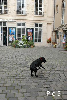
Pic 5 brings us full
circle with another dynamic action shot, minus the human,
sorry, minus Maureen. It's a much better action in itself,
because we can see the ball first of all, and then there's
the eager open jaw, the two front paws and the wagging tail
to boot.
So to sum up, you could
say the choice in this section is between action and
inaction, and the emotions stirred up by it in this context.
Tricky!
Composition This is the only other aspect I'm going to cover in this lesson, as issues such as focus and exposure, not to mention ambient lighting conditions are more or less constant over the five pics. Now, I'm unfortunately going to eliminate Pic 5 immediately, due to the fact that... the name of the theatre has been cut in half. For me, written names, and especially famous or atmospheric ones have to be treated with respect. In this case the curious name of this lovely little theatre gives a real sense of place and I want it in it entirety, despite the fact that the dog's position is great. Pic 2 has a strong perspective thanks to the line of paving stones leading from the open door to the dog and then to us. I like it a lot, but if I'm forced to choose... Pic 1 is a bit to 'busy' for me - the tables, the people, the theatre doors, the other doors... Of course, I could and will crop later, but nevertheless, this one isn't going to make the cut for me. Which leaves Pics 3 and 4. To arch or not to arch... that is the question. Well, in the end, I shall probably work on both of them for my portfolio. The pic with the arch does have, let's be honest, a classic framing device and is quite nicely balanced, along with a pleasing subject position and pose. And Pic 4 positively oozes pathos, and being a sensitive soul on occasion that's why I'll probably go with this one in the end. Even the lack of arch contributes to the feeling of abandonment which may be inexistent, but we can imagine what we like, can't we? (By the way, you'll notice that in the final pic I ended up making almost the bottom half of the picture cobblestones. The way things were working I wasn't getting enough feeling of isolation with a traditional crop. This big space in front of Fido emphasises his imagined loneliness, and the texture is reasonable in the end after some fiddling.) Contrast As this analysis progressed I thought of another judging criterion: contrast. I noticed that two of the shots, funnily enough the two finalists from the Composition section, Pics 3 and 4, had stronger contrast than the others. This was due to them being taken from further away from the subject, underneath the arch, so there was less overhead lighting, which was extremely flat due to cloud cover. The camera was also shooting more horizonally in Pics 3 and 4, allowing the spaces between the cobbles to become more obvious. And the winner is... Pic 4 (with an honourable mention to Pic 3 too!)
Before &
After

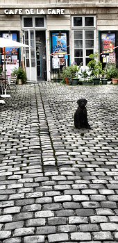
Photo Ideas
Summary
This lesson belongs to the following sections... ~ under development ~ |

