|
FREE On-Line Digital Photography Course "Need I Say More?"
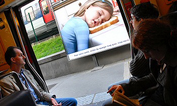
The drawn faces, the nodding sleepwalkers, the nervous phone tappers, the 'personal' music squeakers, the shameless make-up appliers inviting the whole train into their bathrooms... this is what the French call 'métro-boulot-dodo' (tube-work-sleep). The daily grind. The rat-race. Have a look around - you'll probably find some in a train near you.
Key points
Internal
Commentary
The ad is actually for
a bread of the type my father used to sneeringly call
'cotton wool' but which the producers are apparently
flaunting as 'so soft and fluffy (not to mention sickly
white) you could use it for a pillow'. At least I assume
that's what they're saying, rather than 'we're all tired as
hell in the morning'. But the second interpretation is by
far the more interesting in the context of this photo.
In reality, we're all
tired as hell in the morning. And the irony of these sleepy
commuters gazing out at someone who seems to feel exactly
the same as they do is rather delicious.
But the true
strength of this sort of image is that an independent
element seems to be commenting on another element in the
same image, without the artificial manipulation of the
photographer.
The poster seems to be
mocking the grim reality of those blearily gazing out at it,
saying 'Hey, look at yourselves, you poor tired rats, you
have a nice day now, y'hear?!'
What's good about this
is that the photographer removes himself by one degree,
allowing the observer to make the connection between the
poster and the commuters for themselves. And when they see
the connection they obtain greater satisfaction than if
someone points it out to them. They feel they have
understood and interacted with the image somehow, and only
after do they possibly say 'the photographer did well
there'.
Another very simple
example of this principle would be a sign on a wall saying
'No dumping' and right below it someone has dumped a whole
pile of crap.
Composition
 Personally,
I luurrrvvveeee angles, and throw them into many of my shots. So
very many pictures are taken from standing eye level, more or
less horizontally, that just this simple choice (shooting at an
angle) can make your picture immediately different. Personally,
I luurrrvvveeee angles, and throw them into many of my shots. So
very many pictures are taken from standing eye level, more or
less horizontally, that just this simple choice (shooting at an
angle) can make your picture immediately different.A pic like this is generally taken quickly, what with the considerations of the sudden interesting poster, the imminently closing doors and the attempt not to disturb the passengers. But that doesn't mean that any old composition will do. Here passengers left and right frame the doorway, which in turn frames the poster, with an echo of another train in the gap. Of all the shots I took
here (I take a lot of shots quickly when I see something I like)
I chose the one with the most extreme angle. Without the dynamic
angles created by the edges of the doors and the poster the
image, for me, was bordering on ordinary. A wacky angle
shouldn't normally be the only creative aspect of a picture, but
it can add to the overall effect.
Public Places I've
had various interesting experiences taking photos in
public over the years, as you might imagine.
The
worst include being mugged and losing expensive
equipment. The gentlest are someone politely objecting.
And of course there are legal considerations too, such
as the right to your own image and the reproduction of
copyrighted images and, can you believe it, the Eiffel
Tower lights.
My
personal approach is to be reasonably careful but not to
be obsessed by it. I know that some of my images do show
people, but when they do I either try to limit the
extent to which they are identifiable, or if they are,
make sure they are not doing something they probably
wouldn't want made public. It's a question of judgement.
I haven't yet had problems, but I imagine one day I
will, and I'll deal with it when it happens.
Photo Ideas
Summary
~ Comment on this lesson in the Photo Blog ~ This lesson belongs to the following sections... ~ under development ~ |

