|
FREE
On-Line Digital Photography Course
 "Metro
Moments" "Metro
Moments"
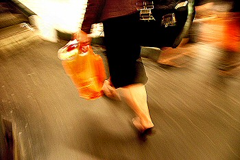
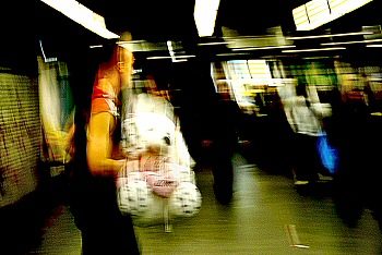
These shots were taken within a few seconds of each other,
during a run-of-the-mill Paris metro journey.
You'll notice that none of the subjects were aware that they
were destined to become stars of the famous Paris Set Me Free
blog, and will probably remain blissfully unaware that their
orange bags, cuddly teds and, indeed, shapely backsides are now
part of photo-folks' folklore.
People we will never know, living moments we will never be part
of, except that now they have become part of our moments,
albeit unwittingly. Such is the wonder and the wistfulness of
the wandering weblogger...
The metro is a
humanistic photographer's wet dream. That buzz of emotions,
tiredness, frustration, snogging, wretchedness, fashion
parade, insecurity... it's somewhere anything could happen,
and everyone is on public display, whether they like it or
not.
The danger is
omnipresent, both technically and ethically speaking.
Although lighting
conditions are often low, the creative photographer should
almost always switch the damn flash OFF when shooting in a
dimly lit public place. Apart from turning people into
ghosts against a pitch black background, what better way to
attract attention to yourself with a nice big burst of light
telling everyone, hey, I'm taking your photo without your
permission: wanna break my camera? Exaggerated? Don't
you believe it.
(of course there is
such a thing as fill-in flash or the 'night' setting on some
cameras, and other such devices, but that's for a lesson on
cute night portraits in front of gaudily-lit tourist
attractions like the Eiffel Tower, so we won't go
into that here ;-)
Back to the metro:
taking shots of people you don't know, and haven't asked,
can be dodgy. So why not do what I did here? The last thing
most people who are hurrying home tired and hungry after a
long day's work are going to suddenly do is twirl round in
case there's some weirdo taking shots of their bottoms. At
least that's the theory.
Personally, I love
these shots: the bright orange bag and muscular calf; the
tough muscular guy with the giant ted; and of course my
greatest weakness and source of some of my saddest moments:
the perfect butt endlessly undulating and heartlessly
heading away from my lustful lens...
Theme
A picture is a beautiful
thing. But in some situations there is strength in numbers,
especially if you are trying to convey the atmosphere of a
specific place or event.
The trick is in making each
image tell it's own story of the same event. They must be
different and yet the same. Uniqueness and unity. I guess you
see what I'm trying to say!
A theme is particularly
important for exhibitions or other public displays, be they of
photos or art or any kind of artistic endeavour.
Although the subject matter
of each photo may be dissimilar, if my Parisian audience can't
perceive a certain unity running through the whole thing they
will simply dismiss the whole exhibition, in their inimitable
way, as n'importe quoi.
This marvellously concise
and contemptuous French expression, for which I still haven't
found a satisfactory English version, roughly translates as 'any
old thing' (but with much more bite!), and is to be avoided like
the plague!
Here I have attempted to
convey the theme, the unity, in two or three ways.
First of all, they are all
shot in the Parisian metro, and I've told you so, so this is
hovering somewhere in your mind to hopefully link the whole
thing together.
 Secondly,
I told you that they were all taken within seconds of each
other. Although this isn't dramatically different from point
one, it does add a certain 'oh!' factor to the experience. Secondly,
I told you that they were all taken within seconds of each
other. Although this isn't dramatically different from point
one, it does add a certain 'oh!' factor to the experience.
Thirdly, there is an
honesty in the style in the shots. I didn't crop any of them in
the slightest, and knowing that fact should help you not to
admire my enviable snapping skills, but rather to feel that you
are truly entering into the same experience as I had as I took
these pics. Which as far more important in the end.
And finally, the effects I
applied afterwards are more or less identical (see the next
section), so there isn't a clash of styles as you look at them.
Thus lives the theme.
Processing
In order to emphasise the
unity of these three shots, all taken together during a single
Parisian metro trip, I processed them identically.
I made the blacks black and
the whites white. I didn't go nuts on the saturation, as that
can interfere with the integrity of the image. In other words,
too much in-yer-face colour can get in the way of the power of
the image itself.
I did add a bit of grain
and other stuff, as I love this gritty dirty effect in
combination with the sweeping whirling colours of life, but to
all of them, and in moderation.
(Click on any of the images
on this page to see a bigger version of the shots.)
Display
A final quick point. As
we're talking about themes and displays, don't forget to look
for 'the bigger picture' as you put your show together.
Look at the following
displays of the same three shots. Which do you prefer? No.1?
No.2? No.3? You decide!
Have you decided?
Personally, I prefer the
third option, although each has its merits, and the context can
change everything.
Classically speaking,
Display 3 is coherent, because within the mini-universe of
these three shots, the guy on the left is moving towards the
middle, the woman on the right also, and the middle pic has a
woman heading straight into the picture, which is a very
stabilising image.
Of course, the direction in
which the various people are heading in the shots is only one
balancing factor. If you want two lighter shots to frame a
darker one, then Display 2 is more satisfactory.
If alienation and people
moving away from each other is your thing, then Display 2
also fits the bill, although another possibility would be as
shown below:
Display 1 is just an
incoherent disaster. Enough said!
-
get in the metro or
any train station and walk around, behind people,
shooting away with your camera at waist-height. If
someone turns around just look straight ahead and keep
on walking!
-
decide on a theme and see how many different ways you
can use it to add coherence (a common theme) to your
work
-
display your work as a whole, several pictures
contributing to a single entity, and see the added power
that gives
-
ask
your audience what they think when they see several
different pics on the same topic - did they spot the
link?
Then comment on this
lesson in the Photo Blog with a link to your best result - we all want to see
them!
-
the metro
- there are wonders and dangers alike, but whatever you
do, don't miss out on this wondrous microcosm of human
existence
-
theme - one of the best ways of 'honing' your
efforts is to shoot to a theme. Mine's Paris, but within
that I have many sub-themes, the Paris metro being one.
You can find or invent themes wherever you are, and the
direction they will give you can only add to the power
of your images
-
processing - whatever effects you are using, if you
want unity in your work or a display for a specific
occasion, try to stick to the same look: people
will remember you if you have your own recognisable
style
-
display - don't stop your creativity once you've
produced your individual images: don't forget that
visitors to your exhibition will be seeing the whole,
and the larger reality of your photography will be the
overall impression of the exhibition. Be daring... are
you an artist, or what?!
~ Comment on this lesson in the Photo Blog
~
|

