|
FREE On-Line Digital Photography Course "Improving Reality"
The purists would say that the authenticity and 'art' of photography has been irrevocably damaged by the advent of digital technology. The pixel bods don't understand what they're on about. And those, like myself, who have crossed over from the old methods by happily incorporating the new enjoy the best of both worlds: enhancing the essential techniques for taking a great shot before snapping with some of the marvellous new possibilities available after the event. If you work hard to make sure the original picture has merit, then the bewildering gamut of special effects or just ways of correcting unfortunate restrictions or mistakes such as poor lighting conditions or camera shake are all perfectly acceptable tools in the modern creative photographer's box of tricks.
Key points
Atmosphere
This is the second
enigmatic, otherworldly according-squeezing chick I've seen
haunting the slopes of Montmartre over the last year. I
wonder if there's some sort of training course for
enigmatic, otherworldly according-squeezing young ladies who
are then deployed at strategic tourist traps scattered
around the city to keep the punters (and photo tour guides)
happy.
Whatever the truth, I
can't help being captivated when I see a scene such as this.
However, often there are, unsurprisingly, horrible hoards of
gaudily-dressed tourists traipsing past, getting in the way,
and generally messing up the shot in one way or another. In
addition, this day, the lighting was flat, and the backdrop
(the wall) resolutely grey.
So how do you deal with
this? It's actually very simple. To solve the problem of the
tourists you just stand in the same place, or several places
in view of the subject, and snap many many shots.
To deal with the poor
lighting conditions, you decide what sort of atmosphere you
want to create and play around afterwards in your favourite
image processing package!
I decided I wanted to
increase the saturation of the colours whilst adding a
slight level of haze or dispersedness of lighting to enhance
the ethereal quality of the subject.
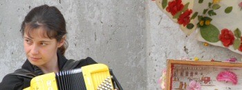
BEFORE 
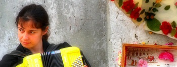
BETTER?
 This wasn't done with a single operation, but a combination of about five different effects, and I honestly can't tell you anything else than play around yourselves with all those amazing creative possibilities and see what happens. There are no rules to originality!
One word of warning,
though. As ever, make sure the effects complement the
subject and make sure the picture has merit before applying
weird special effects indiscriminately.
Perhaps most important
of all, be aware of the point of no return, where the
effects have taken over the image, and the first thing
someone looking at the picture thinks is 'Photoshop'!
In this image I even
retraced my steps a bit, reducing certain effects, to make
sure the modifications enhanced the original image rather
than taking over. But in the end it's for the viewer to be
the final judge.
Expression
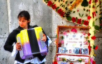
In fact, it's not really an expression - her features remain strangely impassive RIGHT WORD?. But the sideways glance as she plays is marvellous. She's looking out of the photo, which allows us to imagine either prosaically that someone has just attracted her attention, or much more poetically that she is elsewhere in her mind, perhaps carried away by the music she is playing so lyrically. CompositionThe picture itself is split perfectly down the middle by the change in shade of the grey wall, the girl occupying one side and her case and the parasol the other. The diagonal of the parasol creeping into the other half of the picture links the two sides and offers the girl her own internal frame. In fact, the girl is entirely alone, completely surrounded by the grey which contrasts well with the saturated unusual colours of her according and the warm tones of her skin. This isolation adds a certain poignancy to the image, linked to her enigmatic expression and elsewhere gaze. Her only friends seem to be her travelling case containing her wares and her colourful parasol, and it makes you wonder who she really is and what her life is like as a street singer in the winding alleys of Montmartre. And I've only just noticed myself the beautifully pleasing symmetry of the two near vertical lines leaning out just slightly on each side of the picture: the joint in the wall on the left and the parasol support on the right. I honestly wasn't conscious of them until finishing this section but I guess subconsciously I must have cropped the photo thus and I've just given myself a pat on the back for doing so!
Photo Ideas
Summary
~ Comment on this lesson in the Photo Blog ~ This lesson belongs to the following sections... ~ under development ~ |


