
![]()
|
FREE On-Line Digital Photography Course "Do You Dream In Colour?" (Disconcerting Composition)
Learning my craft in the tricky tailwinds of the rule of thirds and other such arcane devices, I have an almost pathological fear of the geometrically suspect. And yet. And yet, I'm an artist, which means that although I'm concerned by the fact that her face (because she is a person, you know) is almost dead centre in the picture, something tells me that this is how it must be. How she must be. And that's enough.
Key points
Composition
In fact, the only
reason I had problems with the composition was because I
couldn't reframe the original without chopping out something
I didn't want to lose.
I wanted the column
behind her. I wanted a reasonable amount of balancing column
for her to gaze into, wistfulness oblige.
Theoretically, I wanted
her more to the left, or more to the right.
That goes without saying...
And I didn't want to
chop the top of her head off! The more I looked at it, the
more I was feeling a panoramic (in other words: long,
landscape) composition. Which would also solve my
composition problems. Almost. Unfortunately, whatever I did,
she still ended up with her face slap bang in the middle of
the pic.
There was also another
extremely strong compositional element though: the flower (a
real one, found in her hair, not placed there by me,
although I could be capable of such an act..). This does
respect the good old rules which demand something lying
along one of the thirds of the pic, and yes, it's true that,
visually, it's normally more pleasing that way!
You can break the rules
much more effectively once you actually know them...
Colour
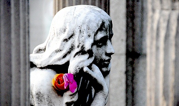 I
did play around with this pic after I took it, but I didn't
mess too much with the colours, and certainly didn't pick
out any area and colour it specifically, or black and white
it out. If you look carefully at the columns you can still
see the hints of beige or cream which tell you that it
really is a colour pic. I
did play around with this pic after I took it, but I didn't
mess too much with the colours, and certainly didn't pick
out any area and colour it specifically, or black and white
it out. If you look carefully at the columns you can still
see the hints of beige or cream which tell you that it
really is a colour pic.
A graveyard is an ideal
environment for playing around with natural contrasts
between colour and black and white. The cemetery is rich in
opportunities for weird and wonderful photos.
It's up to you to see
them, as you stroll past nonchalantly, your super-sexy
mega-zoom lensaroony slung casually over your shoulder... if
you don't point it at something amazing, you ain't gonna get
the shot.
Depth of
field
Look
at all those variegated lines of grey in the pic, all
gorgeously out of focus. Without them, the picture of
the girl's head wouldn't be half as eye-catching or
moving.
For
something to hit you, there has to be something else
that doesn't! The girl is sharp because what is around
her is fuzzy. The flower is particularly sharp.
Did you notice? Maybe it was intentional.
Luckily, we photographers have a choice. We can decide
what we want to focus on! Emotion
It's a statue. She
doesn't move. And even less than most, coz she's in a
graveyard...
And yet she emanates
such compassion and longing that it's difficult not to be
moved by her.
Photo Ideas
Then comment on this
lesson with a link to your best result - we all want to see
them!
Summary
~ Comment on this lesson in the Photo Blog ~
~ under development ~
|