![]()
|
FREE On-Line Digital Photography Course "Fishing For Complements" [listen to the lesson]
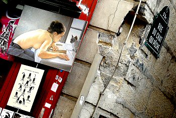
Almost certainly not a coincidence, but nevertheless a pleasing repetition of the theme for any observant passing snapper. And quite apart from that obvious theme, you've got some lovely eroded brickwork, a bent-out-of-shape water pipe, and even an Eiffel Tower t-shirt to remind us where we are, after all! (not to mention the topless girl for the boys...) Throw in a jaunty angle, crop carefully, zap it up a bit, and there you have it - a genuinely interesting photo grabbed from a grotty old street corner - marvellous!
Key points
Repetition
This is a classic device, and one of my favourites: repetition of theme. Here, the theme is set by the name of the street, the fishing cat street. It's not so easy to read the name in the picture on this page but in a good quality version it's fine. Then, joy of joys, you realise that the little tourist store on the corner has adopted this idea and placed a whole bunch of cat-related stuff right next to the sign. There's everything from a fine-art painting to a funny poster to a myriad of postcards with cute kitties doing cute kitty things. In this picture I decided to tilt the camera to be able to fit the essential street sign into the same frame as the kitty posters with cats in various undignified positions! The woman looking eye to eye with the Siamese cat is also a wonderful and sexy addition to the theme, and she's even holding a somewhat stalking pussy pose too, crouched over with a hand looking rather like an outstretched paw. Sense of Place There are two obvious hints that we are in Paris here: the typical street sign and the Eiffel Tower t-shirt. It's not necessary to shove symbols of the city in people's faces in every shot, but when they are there, they are important items to be used wisely. The Eiffel Tower is such an iconic symbol that it tends to draw the viewer's gaze, and that isn't what I want here. Which is why I've made sure it's way off to the side, with a third of it chopped off, so that it influences and enhances the atmosphere of the shot but doesn't take over. There is another aspect of this photo which says 'Paris' but much more subtly. That's the wall. These light-coloured, ribbed ground floor facades are typical of Haussemannian Paris and will be recognised by connoisseurs, although the degraded state of the building is a nicely ironic wink at the fact that not all Paris is in the immaculate state the tourist brochures might have you believe. The crumbling stonework is also infinitely more visually interesting from a photographic and textural point of view, and also livens up what might be a less interesting right-hand side. The pipe hanging in mid-air very effectively emphasises the corner in the absence of the bricks and nicely divides the picture into two-thirds to the left and one-third to the right, with more happening in the larger part, which is fine here. Post-processing
By playing around in some of the menus in any more sophisticated photo manipulation program you can counter these problems quite easily. My personal photographic goal is normally to produce images which hover somewhere between enhanced photographic reality and art. In this case it leans more to the former, as I haven't done anything more than make the image much punchier. It's strong enough as it is and applying some of the gimmicky effects would just get in the way here. The picture was originally taken at this angle, so that's not post-processing artifice, but I have cropped very carefully though. I've made sure that there's just a little room between the corners of the street sign, the painting and the poster, and the edges of the frame, so that nothing is chopped where it shouldn't be which could trouble the inner eye and its penchant for wholeness and completion. The tilting of the camera, by the way, allowed a near-perfect balance of the sign in the top right and the poster in the bottom left. Nice.The
Photo Ideas
Summary
~ Comment on this lesson in the Photo Blog ~
|