|
FREE On-Line Digital Photography Course "Art Out Of Art"
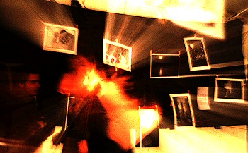
This crazy shot has one of the strangely disproportioned visitors emanating enough radiance to herald the second coming, while another shadier figure is content to just look on bemused. Even the photos in the exhibition itself are joining in with the fun. Quite disturbing really.
Key points
Atmosphere
You would be quite
surprised at how boring this event actually was,
photographically speaking. I don't mean the photos on
display, which were great. I mean the opportunities for
creating a memorable shot. It was one of those art
collective type events, where bare prints were attached to
washing lines with clothes pegs like so many drying socks
swaying in the breeze. Admirers, the curious and 'friends of
the artist' milled around while I told myself 'Hey, you're a
photographer... what can you do with this, then?'.
I decided to try and
give the pictures some life of their own, and again try and
integrate some of the visitors in a weird, supernatural type
of shot. I'm pretty pleased with the result, but I couldn't
really have predicted how it would turn out - that's one of
the joys of photography.
Composition
The bright figure's head and neck are nicely framed by four
of the photos on the black backdrop. Although he is looking
rather out of the picture, the space between him and the
left-hand side is filled with a very dark face which creates
a marvellous contrast.
The large bright part
bottom right is countered by the same bright part at the
top, and the little sliver of brightness bottom left helps
maintain the balance.
 The
two pictures which seem to be emanating rays of light in the
top left quarter are particularly well placed around the
smoking head, and are balanced by the four less prominent
pictures on the right hand side. The
two pictures which seem to be emanating rays of light in the
top left quarter are particularly well placed around the
smoking head, and are balanced by the four less prominent
pictures on the right hand side.
You can see how
important balance and contrast are in creating an effective
composition.
Colour As scientific principles and a bit of luck would have it, this photo reduced down to an effective range of warm colours from rich sepia and deep orange through to very pale yellowy cream. This is a characteristic of the lighting in use here, but it nevertheless lends itself to warm, intimate and atmospheric pictures. Technique One of the best ways of getting a striking result in a situation where not much is going on is to zoom in or out with your lens as you take the shot.With a lowish ISO like 400 you have loads of time to play with as the diaphragm stays open trying to let in enough light. If the exposure is taking a second or so, you might want to start zoomed in on a picture or a person for about half a second, then zoom out for the other half second. This gives you a strong image of the picture or person combined with a ghostly whizzing effect during the zoom phase. Flash is
not normally allowed and in general gives awful results
unless you are really doing something creative with it.
Photo Ideas
Summary
~ Comment on this lesson in the Photo Blog ~ This lesson belongs to the following sections... ~ under development ~ |

