|
FREE On-Line Digital Photography Course "Above The Line"
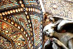
This rather bald-seeming angel (as often happens with my self-portraits when there's a particularly unsympathetic overhead light...) has a touching uplifted gaze and is completely surrounded by the intricate decoration of the doorway. I often wonder about the lives of those who created such creatures - I'd love to have chatted with the sculptors responsible for the wonderful array of phantasmagorical faces that graces the Pont Neuf, for example! Can you imagine the hands of the creator of this little character, gently caressing her fine features and perhaps feeling a real emotion towards this delicately crafted piece of stone?
Key points
Extraneous
Items
The main thing I want
to show through this photo is how important it is to watch
all aspects of what is in the frame carefully.
 In
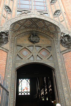
this more global shot of the front of the church you can see
a particularly annoying grey metal wire cutting through the
angels when seen from ground level and capable of ruining
the picture. In
this more global shot of the front of the church you can see
a particularly annoying grey metal wire cutting through the
angels when seen from ground level and capable of ruining
the picture.
You could try and use
an image processing program to remove it later (which would
be a pain), or you could try walking around a little to see
if you can't improve the composition, but that line ain't
going anywhere!
My solution was to look
for a composition which would allow me to avoid the line and
still produce something pleasing.
When I compared my shot
to those of my tour members, sure enough, there was the
thick grey cable in every shot. When they asked me why they
couldn't see the cable in my shot, as told them because
first of all I realised it was there in the first place, and
secondly, made sure it wasn't in my final view.
The same goes for the
classic horrendous rubbish bins, lampposts growing out of
heads and all manner of disasters. Keep your eyes open (and
move them around a bit too!).
Composition
Very often you can manipulate the composition and the
restrictions if you think about it. That's what I did here.
I wanted to take a shot of the angel but also to avoid that
awful wire at all cost.
I realised that if I zoomed in on the angel just above the
wire, placing her in the bottom right, I could then give her
lots of attractive celestial coloured blobs to be devotedly
gazing upwards into.
As with the principle
of giving people who are walking or riding some space to
move into, the same goes for gazes. As a general rule, it
makes sense to either give people some space within the
frame to look into, and if appropriate include the thing
they are looking at too.
Post
Processing
Architectural shots often benefit from a bit of help
with the colours and contrast, as murky greys are
not the sexiest of subjects.
Here I cleaned things up to make the shot pop out
much more, while not really changing what you could
see with the naked eye, but which didn't come across
in the original image.
And anyway, what's wrong with a bit of divine
intervention from time to time!
Photo Ideas
Then comment on this
lesson with a link to your best result - we all want to see
them!
Summary
~ Comment on this lesson in the Photo Blog ~ This lesson belongs to the following sections... ~ under development ~ |


